Stay on the Grid Lab
Introduction
CSS Grid is a powerful layout system which allows for the control and placement of items into columns and rows
Objective
For this lab, you recreate the different layouts using the required CSS Grid techniques.
Requirements
The following instructions explain the different changes that need to be made to the site.
- Download the Stay on the Grid Starter Files. Add the appropriate CSS to the
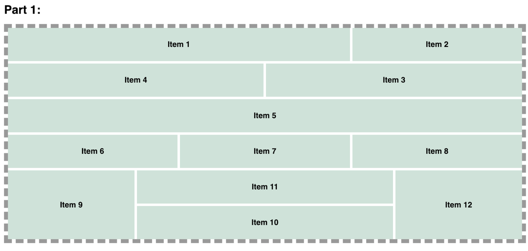
style.cssfile to make the changes to the web page. No changes should be made to theindex.htmlorbase.cssfile. - For Part 1, create a grid 12 columns and 6 rows using the
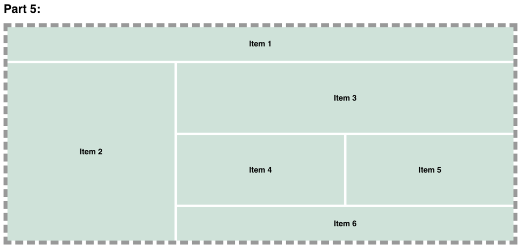
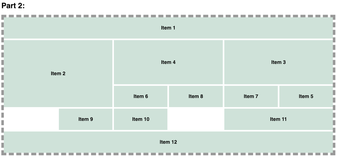
grid-template-columnsandgrid-template-rowsproperties. Then recreate the Part 1 Layout usinggrid-columnandgrid-rowproperties (see image below). Do NOT usegrid-template-areas. - For Part 2 create a grid 6 columns and 6 rows. Then recreate the Part 2 Layout using the
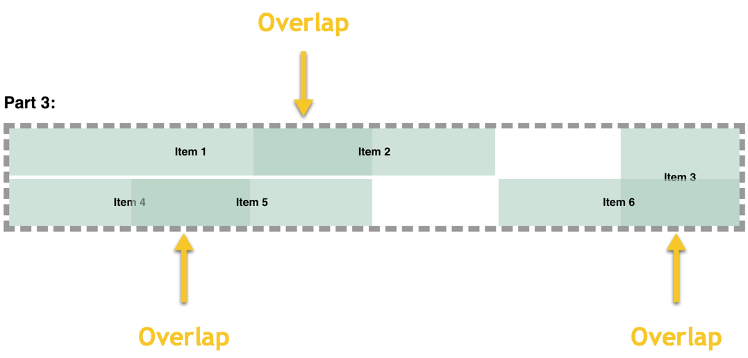
grid-template-areasandgrid-areaproperties (see image below). - For Part 3, create a grid 6 columns and 2 rows. Then recreate the Part 3 Layout (see image below).
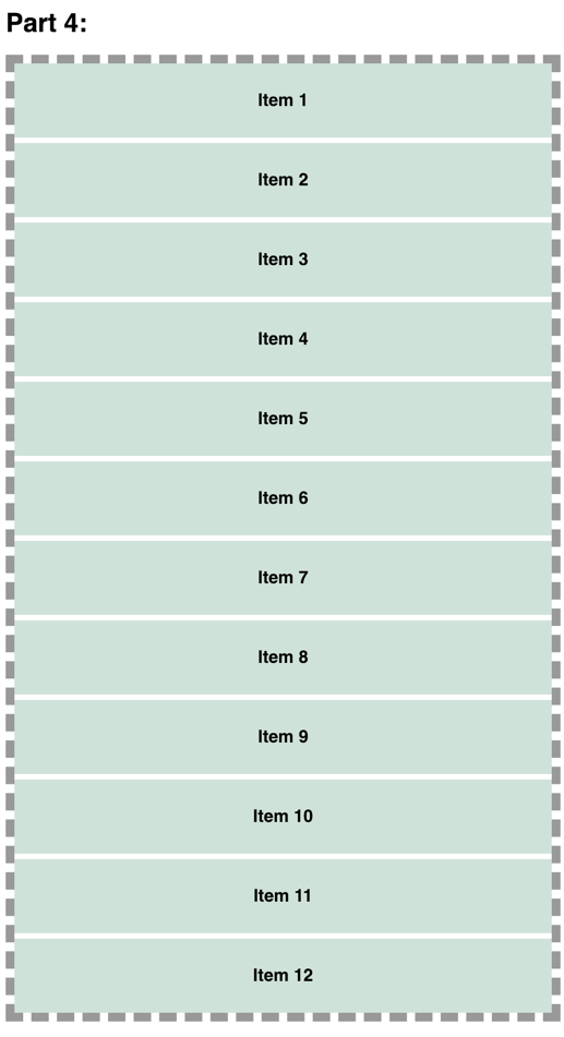
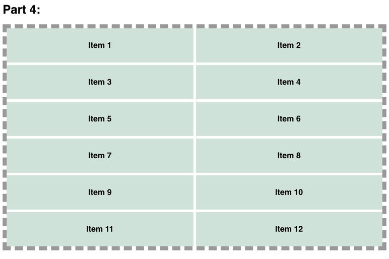
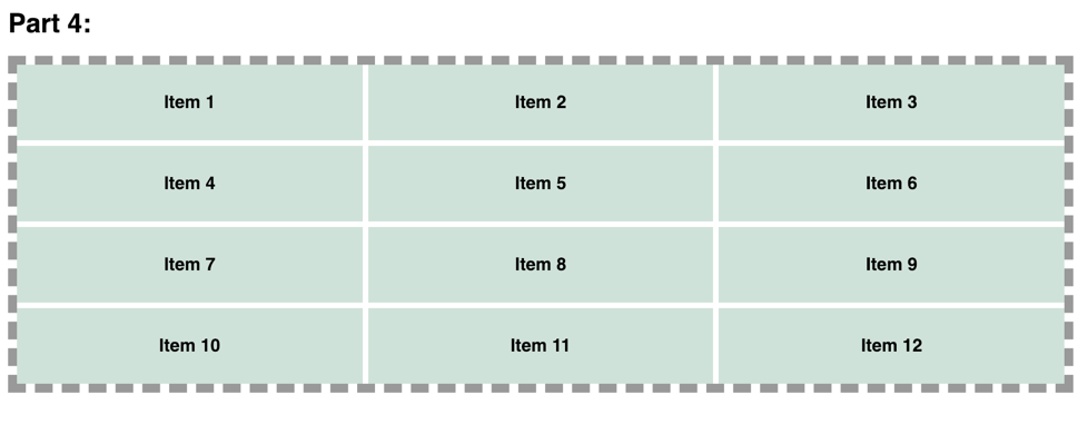
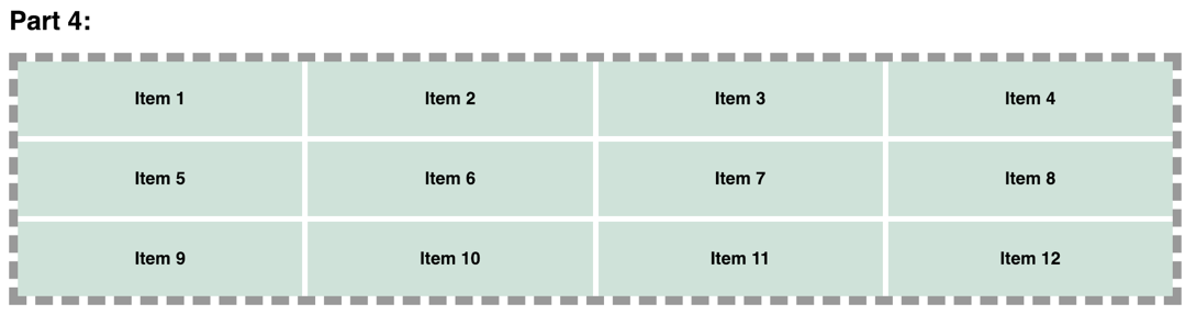
- For Part 4, create a completely responsive grid where each grid item will be no smaller than 250px (see images below). Do NOT use media queries.
- For Part 5, recreate the Part 5 Layout using nested grids (see image below).
- Once completed, submit the
style.cssfile to the Stay on the Grid assignment on BrightSpace.
TIP
Target each part's item by including the appropriate part class (.part1, .part2, etc) in the CSS selector.
Example: .part1 .item1 { }
Part 1 Layout
Part 2 Layout
Part 3 Layout
Part 4 Layout
Part 5 Layout