Increase Response Lab
Introduction
Responsive Images is more than just making image grow and shrink. It is using the right image for any situation.
Objective
For this lab, you will use responsive image techniques and the files provided, make the right image appear on the web page.
Requirements
Follow the requirement below to update the web page to incorporate the techniques of responsive images.
- Download the Image Response starter files, and make the necessary changes to the
index.htmlpage, No changes will need to be made to thestyle.cssor to the images. - Using the
srcsetattribute and the provided images, updateheader__imagetag to allow the browser to choose the best available image. - Using the
srcsetandsizesattributes and the provided images, update thefooter__imagetag to allow the browser to choose the best available image. Note: the image is being displayed at 80% of the viewport width (80vw). - Using the
srcsetattribute and the provided images, to update the<img>tag inside themain__imagetag to allow the browser to choose the best available image. - Add
<source>tags withmedia,sizes, andsrcsetattributes to themain__imagetag to change the image when certain media conditions are met:- For windows between 768px and 1027px, using the images provided, allow the browser to choose the best available version of the
main-image-portraitimage. Note: this image will be displayed at 50% of the viewport width (50vw). - For windows 1028px or larger, using the images provided, allow the browser to choose the best available verion of the
main-image-squareimage. Note: this image will be displayed at 33% of the viewport width (33vw).
- For windows between 768px and 1027px, using the images provided, allow the browser to choose the best available version of the
- Add
<source>tags withmedia,sizes, andsrcsetattributes to themain__image2tag to add the image when certain media conditions are met:- For windows between 768px and 1027px, using the images provided, allow the browser to choose the best available version of the
main-image-landscapeimage. Note: this image will be displayed at 50% of the viewport width (50vw). - For all other conditions, no image should be displayed.
- For windows between 768px and 1027px, using the images provided, allow the browser to choose the best available version of the
Layout Examples
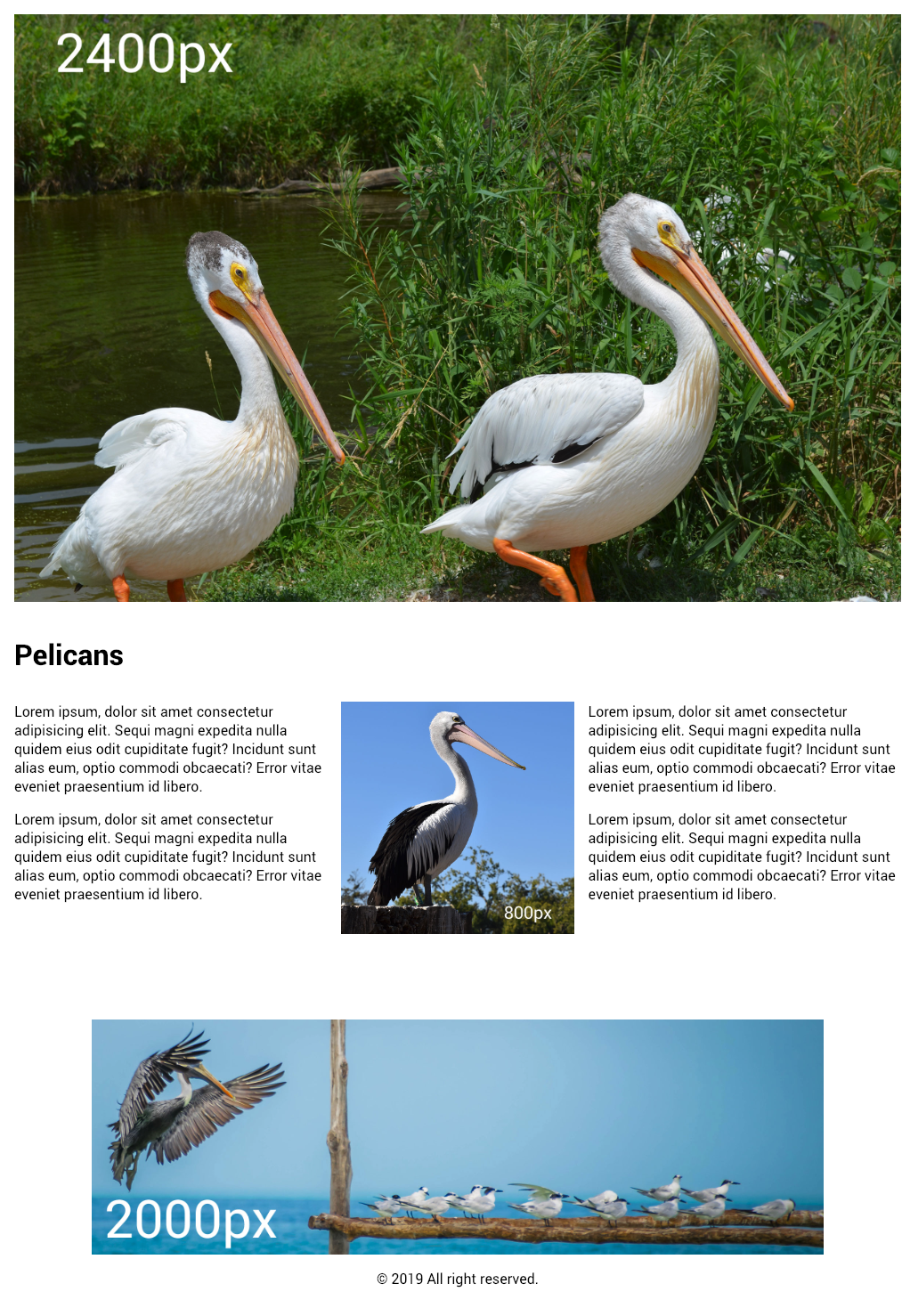
Viewport Width: 600px (DPI 2x)
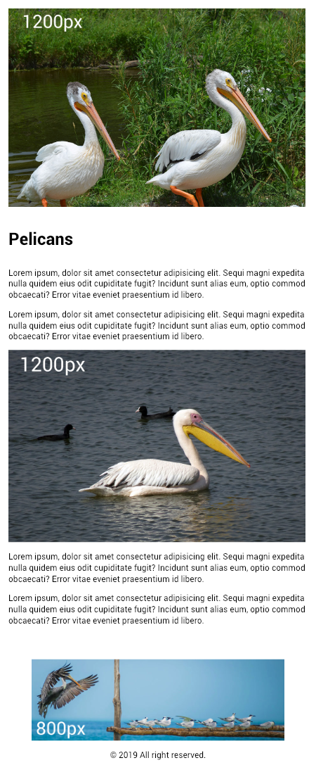
Viewport Width: 768px (DPI 2x)
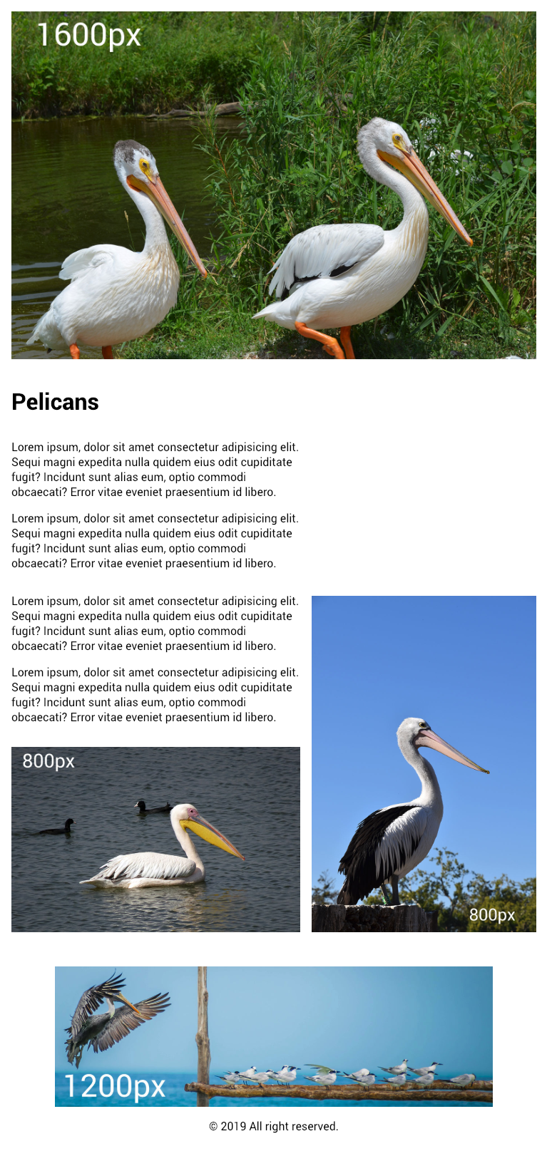
Viewport Width: 1028px (DPI 2x)